Email Accessibility

Accessible emails work for every subscriber, including those using screen readers. Here's what to check and why it helps.

Designing emails so they work for every subscriber, including those using screen readers, low vision settings, or other assistive tools.

What Is Email Accessibility?

Email accessibility means your emails can be read and understood regardless of how someone accesses them, whether that’s a screen reader, high contrast mode, or simply a small phone screen in bright sunlight. It covers things like alt text, color contrast, and font sizing.

Why Email Accessibility Matters

A meaningful share of any subscriber list has some form of visual or reading difference, whether temporary or permanent. Email marketing that ignores this excludes real customers, and in some regions, accessible design is also a legal expectation, not just a best practice.


There’s a practical upside too. Accessible design choices, like clear contrast and readable font sizes, tend to improve readability and engagement for every subscriber, not just those using assistive tools.

What Accessible Email Design Looks Like

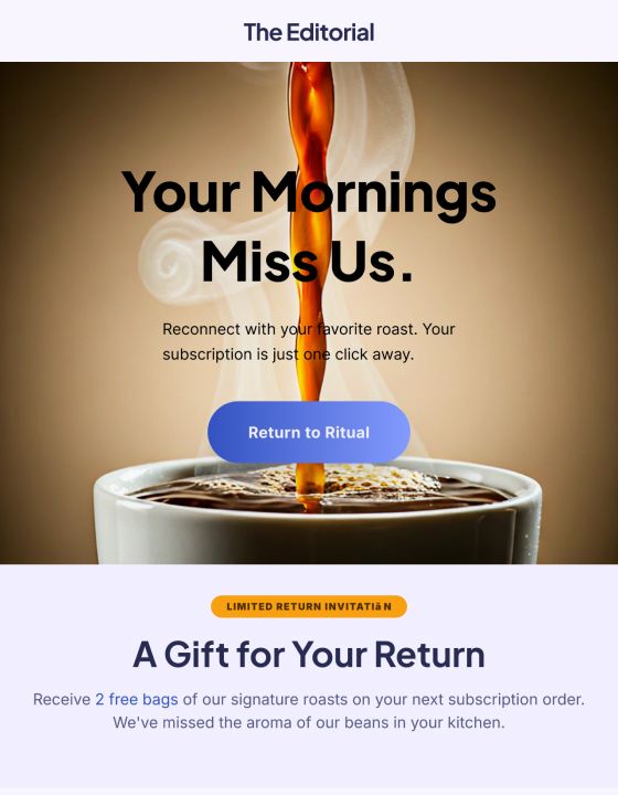
Descriptive alt text on every image, especially product photos


Sufficient color contrast between text and background


Readable font size, generally 14px or larger for body text


Semantic HTML structure, using proper headings rather than styled text pretending to be a heading


Clear, descriptive link text, avoiding vague phrases like “click here”

How to Check Email Accessibility

1. Review color contrast using a free contrast checker tool
 
2. Confirm every image has meaningful alt text, not just a filename
 
3. Test with a screen reader if possible, or at minimum review the plain-text version
 
4. Check font sizes render clearly on both desktop and mobile

How Adflipr Helps

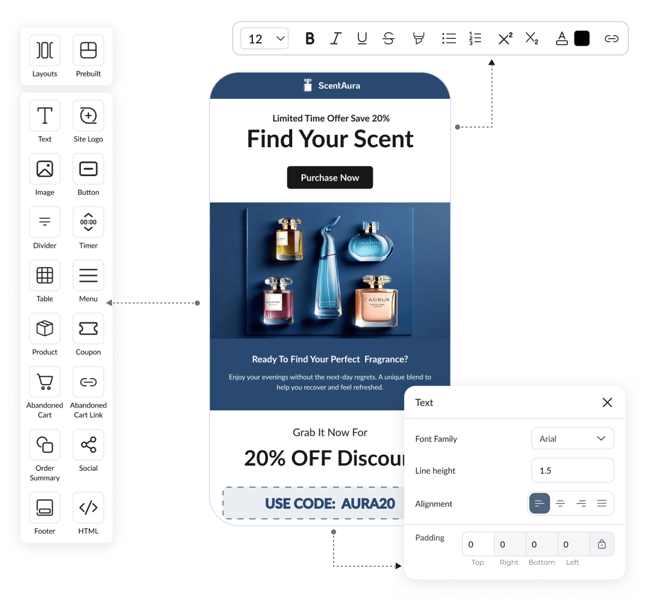
Adflipr’s email builder prompts for alt text when adding images and uses accessible color and contrast defaults in its templates, so accessible design is the starting point rather than something added on manually afterward.

Best Practices

– Write alt text that describes the image’s purpose, not just what it shows


– Keep contrast high between text and background colors


– Use real headings in your HTML structure, not just larger, bold-styled text


– Write link text that describes where it leads, rather than generic phrasing

Common Mistakes

– Leaving alt text blank or filling it with a generic filename


– Using low-contrast color combinations that look stylish but are hard to read


– Relying entirely on color to convey meaning, like a sale badge with no text label


– Skipping accessibility review because it feels like an extra step under deadline pressure

Frequently Asked Questions

It means designing campaigns so every subscriber can read and act on them, regardless of vision or how they access email. For ecommerce specifically, that includes product image alt text and clear, high-contrast calls to action.

Use semantic HTML headings instead of styled text, write descriptive alt text for every image, and keep link text specific rather than vague. A screen reader relies on this structure to read the email in a sensible order.

A common accessibility standard is at least 4.5:1 contrast between text and background for normal body text. Free contrast checker tools can confirm this instantly for any color combination.

Often positively. Clear contrast and readable font sizes tend to improve readability for everyone, not just subscribers using assistive tools, which can support better engagement overall.

Ready to Grow Your Store?

Start using powerful email marketing automation to recover more sales, increase repeat purchases, and grow your revenue no credit card required.