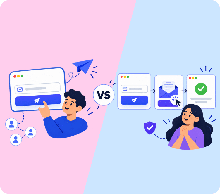

It is tempting to treat the unsubscribe footer as an afterthought, something to bury in tiny gray text at the very bottom of the email. That instinct usually backfires, since a hard-to-find or broken way to unsubscribe causes more damage to your sender reputation than the unsubscribe itself ever would, and it’s a mistake that’s easy to avoid once you know what inbox providers are actually watching for.
Quick answer: A good unsubscribe footer has a visible link, your business address, and a working preference option. Never hide it. Easy unsubscribes protect deliverability better than difficult ones.
What a Compliant Unsubscribe Footer Actually Needs
Building a footer that actually satisfies email compliance rules starts with knowing what regulators actually require, not guessing. Most major email laws, including CAN-SPAM in the US and similar rules elsewhere, require a few consistent elements in every marketing email’s footer:
- A visible, working unsubscribe link
- Your business’s physical mailing address
- Clear identification of who sent the email
Some regions have stricter requirements. Rules like CASL in Canada also expect a working unsubscribe method that does not require the subscriber to log in or provide extra information beyond confirming the request. Skipping any of these is not just a compliance risk, it also signals to inbox providers that your program is not being run carefully, which can affect deliverability over time and make even your compliant future sends harder to land in the inbox.
Make the Unsubscribe Link Easy to Actually Find
A frequent mistake is making the unsubscribe link nearly invisible: tiny font, low contrast gray-on-white text, buried under several paragraphs of legal disclaimer. This does not stop people from unsubscribing. It just pushes frustrated subscribers to click "report spam" instead, which hurts your sender reputation far more than a normal unsubscribe would, since spam complaints carry much heavier weight with inbox providers than a routine opt-out.
A few practical guidelines:
- Keep the unsubscribe link no more than a couple of points smaller than your body text
- Use enough contrast that it’s readable, not just technically present
- Place it near the top of the footer block, not buried at the very bottom under legal text
Keep the Unsubscribe Process to One Click
Every extra step between clicking "unsubscribe" and actually being removed increases the chance a subscriber gives up and marks the email as spam instead. The unsubscribe process should not require logging in, entering a reason, or confirming multiple times before it actually takes effect.
If you want to offer a preference center instead of a full unsubscribe, present it as an option, not a requirement: "Unsubscribe" and "Manage preferences" as two separate, clearly labeled links, rather than forcing everyone through a preferences page before they can leave.
Design the Landing Page, Not Just the Link
What happens after someone clicks unsubscribe matters as much as the link itself. A generic, unbranded "You have been unsubscribed" page feels abrupt and can even make a subscriber wonder if the click actually worked. A branded landing page that confirms the action clearly, in your own visual style, feels more trustworthy and gives you one more (low-pressure) chance to offer a link to adjust frequency instead of leaving completely.
Avoid dark patterns here. Guilt-trip copy, hidden re-subscribe traps, or a "are you sure?" page designed to confuse rather than clarify all erode trust and increase the odds of a spam complaint instead of a clean opt-out. The goal of this page is confirmation and, optionally, an easy alternative. It is not a place to talk someone out of leaving.
Design the Footer to Match Your Email, Not Fight It
Every email footer carries a mix of required legal text and optional brand elements, and good email footer design does not need to look like a legal disclaimer bolted onto the bottom of an otherwise well-designed email. Looking at real email footer examples from brands you trust is a quick way to see this done well: using your brand’s fonts and a subtle divider to separate the footer from the main content keeps the whole email feeling cohesive, while still keeping the required text legible.
Watch the total footer length too. Emails over roughly 102 KB can get clipped by some inbox providers, which sometimes cuts off the unsubscribe link entirely if the footer sits too far down a long email. Keeping the footer reasonably concise avoids this problem entirely.
Mobile Rendering Deserves Its Own Check
Most email footer testing happens on desktop, but the majority of marketing email is now opened on a phone first. A footer that looks perfectly readable on a 27-inch monitor can shrink into an unreadable strip of gray text on a small screen, which quietly defeats the whole purpose of putting the unsubscribe link there in the first place.
A few things worth checking specifically on mobile, since a footer that renders fine on desktop can still fail here:
- Tap target size: the unsubscribe link needs enough padding around it to tap accurately with a thumb, not just enough visual size to read
- Line wrapping: long legal text and physical addresses can wrap awkwardly on narrow screens, sometimes pushing the unsubscribe link itself off the visible area without any scrolling indicator to suggest more content follows below.
- Dark mode rendering: many mobile clients now default to dark mode, and light-gray text that was barely visible on white can disappear entirely against a dark background
Sending a test email to your own phone before every major campaign, not just when the template first gets built, catches most of these issues before a real subscriber ever runs into them.
What to Include Beyond the Legal Basics
Once the required elements are covered, a few optional additions can make the unsubscribe footer more useful without cluttering it:
- A link to update email frequency instead of unsubscribing completely
- Social media links, kept small and secondary to the main content
- A short, honest line like "Didn’t mean to sign up? Unsubscribe here" instead of guilt-tripping copy
How to Test Whether Your Footer Is Actually Working
Most stores build an unsubscribe footer once and assume it’s fine forever. A quick quarterly check catches problems before they show up in your deliverability metrics.
- Click the link yourself. Confirm it actually unsubscribes in one step, on both desktop and mobile, without requiring a login or any additional confirmation screen.
- Check your unsubscribe rate over time. A sudden spike can signal a content or frequency problem, but a rate that’s unusually low compared to your industry can actually mean subscribers can’t find the link and are marking spam instead of unsubscribing normally.
- Compare spam complaint rate against unsubscribe rate. If complaints are rising while unsubscribes stay flat, that’s a strong signal the footer itself isn’t doing its job and needs a redesign, not just a copy tweak.
This kind of check takes ten minutes and catches issues that would otherwise only show up months later as a slow, hard-to-diagnose decline in inbox placement, long after the actual cause has been forgotten.
Key Takeaways
- A compliant unsubscribe footer needs a visible link, your physical address, and clear sender identification
- Hiding the unsubscribe link backfires by pushing frustrated subscribers toward spam reports instead
- The unsubscribe process should take one click, with no login or forced multi-step confirmation
- Design a branded, honest landing page after the click, and avoid dark patterns that discourage leaving
- Watch total email size, since long emails can get clipped and cut off the footer entirely
- Test the footer on mobile specifically, checking tap targets, line wrapping, and dark mode
- A preference center is a good addition, but should never replace a simple, direct unsubscribe option
- Check unsubscribe rate against spam complaint rate quarterly to catch a footer that isn’t working
Final Thoughts
An unsubscribe footer is not the place to be clever or difficult. Making it easy to find and easy to use protects your sender reputation more than any amount of hiding ever could, and that protection compounds with every campaign you send afterward. If you want to understand how unsubscribe rates connect to your broader sending health, our glossary entry on unsubscribe rate covers that metric directly, and Adflipr’s email deliverability resources go deeper into protecting your sender reputation overall. If you send to customers in Canada, our guide on CASL laws covers the specific unsubscribe requirements that apply there.
FAQs
A compliant email footer needs a visible unsubscribe link, your business’s physical address, and clear identification of the sender.
No. A compliant unsubscribe process should not require logging in, and it should take no more than one click to complete.
No, it usually backfires. Frustrated subscribers tend to mark the email as spam instead, which hurts your sender reputation more.
Offer both as separate options. Never force subscribers through a preference center before allowing a direct, simple unsubscribe.
Very large emails can get clipped by some inbox providers, which may cut off the footer, including the unsubscribe link, entirely.
Yes. Good email footer design uses your brand’s fonts and a simple visual divider, keeping the footer legible while still fitting the rest of the email.
Check it quarterly: click the link yourself on both desktop and mobile, and compare your unsubscribe rate against your spam complaint rate.
Many mobile clients default to dark mode, and light-gray text that’s barely visible on white can disappear entirely against a dark background.
A clear, branded confirmation that the request worked, with an optional, low-pressure link to adjust frequency instead of leaving entirely.
Guilt-trip copy, confusing “are you sure” pages, or hidden re-subscribe traps meant to discourage leaving. They erode trust and increase spam complaints.