
The moment right after someone completes a signup form is the single highest-engagement window in your entire user journey.
Yet, over 70% of websites treat it as an afterthought: displaying a dry, robotic “Your request has been processed” message and leaving the user wondering what just happened.
A high-converting user registration success message does three things in five seconds:
- Confirms the exact action (removes friction and uncertainty).
- States the immediate next step (verification, onboarding, or shopping).
- Bridges the on-screen experience to your email welcome series.
Whether you need ready-to-use copy for your app, responsive HTML/CSS modal code for your frontend, or automated confirmation email subject lines, this master guide covers every angle.
💨 Quick Answer: A great registration success message is concise (1-2 sentences), clearly confirms account creation, gives a direct call-to-action (e.g., “Check your email to verify” or “Explore your dashboard”), and matches your brand tone. Never use vague phrases like “Submission received.”
What Makes an Effective Registration Success Message?
A registration success message is microcopy, but it carries macro impact. According to UX studies, users experience a brief spike in cognitive load right after submitting personal credentials. Clear confirmation immediately relieves this anxiety.
The 3 Golden Rules:
- Clarity Above Cleverness: Never sacrifice clarity for personality. Always state that the registration was successful before introducing puns, celebratory GIFs, or secondary perks.
- Eliminate “Dead Ends”: Every confirmation screen must feature a prominent primary action button (e.g., Open Email Client, Continue to Setup, Start Browsing).
- Separate Confirmation from Verification: If email or phone verification is required, state it upfront. Never let a user sit on an inactive account wondering why features are locked.
60+ Copy-Paste Registration Success Message Examples
Select your industry below to grab ready-to-use microcopy tailored to your platform. Each template is formatted into clean, copyable cards for instant deployment.
1. SaaS & Web Applications (Focus: Activation & Time-to-Value)
“Welcome aboard! Your workspace has been created. Let’s set up your first project.”
“You’re in! Your 14-day free trial is now active. No credit card required. [Jump to Dashboard →]”
“Account created successfully! We’ve imported your initial settings. Click below to begin your 2-minute product tour.”
“Boom! You’re all set. Start building your first automation workflow now.”
“Registration complete. Check your inbox for a quick verification link to unlock collaborative team features.”
“Welcome to [Product Name]! Your admin account is live. Invite your team members to get started.”
“Setup complete! We’ve configured your sandbox environment. [Launch Console]”
“You’ve successfully joined [Company]. Your API keys are ready in your developer dashboard.”
2. E-Commerce & Online Stores (Focus: Immediate First Purchase)
“Welcome to the family! Your account is active and your 15% welcome discount code WELCOME15 has been applied to your cart.”
“You’re all set! Enjoy faster checkouts, order tracking, and exclusive member-only pricing. [Start Shopping →]”
“Registration successful! We’ve sent your VIP voucher to your inbox. Claim it on your first order today.”
“Account created! You’ve just earned 100 Reward Points. [Explore Trending Items]”
“Welcome! Your wishlist and saved shipping addresses are now active. [Browse New Arrivals]”
“You’re in! Free shipping on your first order has been unlocked automatically.”
“Account confirmed. Don’t miss today’s flash sale: your member discount is waiting at checkout.”
“Registration completed! Save your favorite brands and receive instant price-drop alerts.”
3. B2B & Enterprise Workspaces (Focus: Security & Compliance)
“Your enterprise profile has been created. A confirmation email has been dispatched to your corporate address for security verification.”
“Registration confirmed. Your organization’s dedicated account representative will reach out within 1 business day.”
“Success! Your team workspace is configured with SSO authentication enabled. [Proceed to Security Portal]”
“Account provisioned. Please complete your company verification step to activate multi-user licensing.”
“Your corporate account is ready. Access your analytics dashboard and download your SLA documentation here.”
“Thank you for registering. Your credentials have been authenticated under SOC2 compliance standards.”
4. Events, Webinars & Ticketed Bookings (Focus: Calendar Retention)
“You’re registered! Your seat for [Webinar Title] on [Date] at [Time] is confirmed. [Add to Google Calendar] | [Add to Outlook]”
“Success! Your registration is complete. We’ve emailed your unique access link and calendar invite to [Email Address].”
“You’re officially on the guest list! Download your digital event badge and review the attendee agenda below.”
“Booking confirmed! Ticket #TK-8942 has been generated. Check your inbox for venue directions and QR check-in code.”
“You’re in! We’ll send you an SMS & email reminder 1 hour before the live stream kicks off.”
“Workshop registration completed successfully. Access your preparatory course materials here.”
5. Online Communities & Memberships (Focus: Social Connection)
“Welcome to the circle! Your membership is active. Say hello to the community in our #intros channel.”
“You’re officially a member! Complete your public profile to start connecting with 10,000+ industry peers.”
“Registration successful! Your founder badge has been unlocked. [Join Today’s Discussion]”
“High five! You’re part of the club. Explore our private forum threads and exclusive member perks.”
“Account created! Introduce yourself in the lounge and bookmark your favorite topic hubs.”
6. Mobile Apps & Toast Notifications (Focus: Compact Microcopy)
“✓ Account created! Tap to sync contacts.”
“You’re registered! Enable push notifications to get instant price alerts.”
“Success! Welcome to [App Name]. Let’s personalize your daily feed in 3 taps.”
“✓ Registration complete. Biometric login enabled.”
“All done! Your profile is ready. [Start Exploring]”
“✓ Signed up successfully as your_username.”
7. High-Trust (Fintech, Healthcare & Legal)
“Your account has been securely created and encrypted. Please check your email to complete two-factor authentication.”
“Registration successful. Your patient portal is now active. All health records are protected under HIPAA compliance.”
“Security verification initiated. Your banking profile is being verified. You will receive an SMS confirmation shortly.”
“Account setup complete. For your protection, please confirm your identity via the secure link sent to your registered email.”
“Client registration confirmed. Your encrypted document vault is ready for file upload.”
8. Overlooked Edge Cases & Error States (The Competitor Gap)
Most sites fail when signups do not follow the standard flow. Use these styled alert cards to handle edge scenarios smoothly:
“Thank you for registering! To maintain community quality, our team reviews all new applications within 24 hours. We’ll notify you via email as soon as your account is approved.”
“We’ve sent a verification link to [email protected]. Please click the link within 15 minutes to activate your account. Didn’t receive it? [Resend Verification Email].”
“Successfully connected via Google! We’ve synced your profile details. [Set a master password] or [Continue with Google].”
“An account with this email address already exists. [Click here to Log In] or [Reset your password] in 1 click.”
“This verification link has expired for security reasons. Enter your email below to receive a fresh activation link instantly.”
Developer UI: Copy-Paste HTML & CSS Success Components
Enhance your registration flow with clean, accessible, responsive components.
1. Responsive Modal Success Card (HTML & CSS)
<!-- Registration Success Card Component -->
<div class="adflipr-success-modal" role="dialog" aria-labelledby="modal-title" aria-describedby="modal-desc">
  <div class="adflipr-card-inner">
    <div class="adflipr-icon-circle">
      <svg width="32" height="32" viewBox="0 0 24 24" fill="none" stroke="#ffffff" stroke-width="3" stroke-linecap="round" stroke-linejoin="round">
        <polyline points="20 6 9 17 4 12"></polyline>
      </svg>
    </div>

    <h3 id="modal-title">Registration Successful!</h3>
    <p id="modal-desc">Your account has been created. We have sent a confirmation link to your inbox. Please verify your email to unlock all features.</p>

    <div class="adflipr-btn-group">
      <a href="/dashboard" class="adflipr-btn-primary">Go to Dashboard</a>
      <a href="/resend-email" class="adflipr-btn-secondary">Resend Email</a>
    </div>
  </div>
</div>

<style>
.adflipr-success-modal {
  display: flex;
  justify-content: center;
  align-items: center;
  padding: 24px;
  font-family: 'Inter', -apple-system, BlinkMacSystemFont, sans-serif;
}
.adflipr-card-inner {
  background: #ffffff;
  border: 1px solid #E2E8F0;
  border-radius: 16px;
  max-width: 440px;
  width: 100%;
  padding: 36px 28px;
  text-align: center;
  box-shadow: 0 10px 25px -5px rgba(0, 0, 0, 0.08), 0 8px 10px -6px rgba(0, 0, 0, 0.04);
}
.adflipr-icon-circle {
  width: 64px;
  height: 64px;
  background: #10B981;
  border-radius: 50%;
  display: flex;
  align-items: center;
  justify-content: center;
  margin: 0 auto 20px auto;
  box-shadow: 0 0 0 8px #D1FAE5;
}
.adflipr-card-inner h3 {
  font-size: 22px;
  font-weight: 700;
  color: #0F172A;
  margin: 0 0 12px 0;
}
.adflipr-card-inner p {
  font-size: 15px;
  line-height: 1.6;
  color: #64748B;
  margin: 0 0 24px 0;
}
.adflipr-btn-group {
  display: flex;
  flex-direction: column;
  gap: 10px;
}
.adflipr-btn-primary {
  display: inline-block;
  background: #565ADD;
  color: #ffffff;
  text-decoration: none;
  font-weight: 600;
  font-size: 15px;
  padding: 12px 20px;
  border-radius: 8px;
  transition: background 0.2s ease;
}
.adflipr-btn-primary:hover {
  background: #4347B9;
}
.adflipr-btn-secondary {
  display: inline-block;
  color: #64748B;
  text-decoration: none;
  font-size: 14px;
  font-weight: 500;
  padding: 8px;
}
.adflipr-btn-secondary:hover {
  color: #0F172A;
}
</style>
2. Slide-In Toast Notification (HTML & Tailwind CSS)
<!-- Tailwind CSS Toast Notification -->
<div class="fixed bottom-5 right-5 z-50 flex items-center w-full max-w-sm p-4 text-slate-800 bg-white rounded-xl shadow-xl border border-slate-100" role="alert">
  <div class="inline-flex items-center justify-center shrink-0 w-9 h-9 text-emerald-500 bg-emerald-100 rounded-lg">
    <svg class="w-5 h-5" fill="currentColor" viewBox="0 0 20 20">
      <path fill-rule="evenodd" d="M16.707 5.293a1 1 0 010 1.414l-8 8a1 1 0 01-1.414 0l-4-4a1 1 0 011.414-1.414L8 12.586l7.293-7.293a1 1 0 011.414 0z" clip-rule="evenodd"></path>
    </svg>
  </div>
  <div class="ml-3 text-sm font-medium">
    Registration complete! Welcome aboard.
  </div>
  <button type="button" class="ml-auto -mx-1.5 -my-1.5 bg-white text-slate-400 hover:text-slate-900 rounded-lg p-1.5 inline-flex h-8 w-8" aria-label="Close">
    <svg class="w-5 h-5" fill="currentColor" viewBox="0 0 20 20">
      <path fill-rule="evenodd" d="M4.293 4.293a1 1 0 011.414 0L10 8.586l-4.293-4.293a1 1 0 011.414 1.414L11.414 10l4.293 4.293a1 1 0 01-1.414 1.414L10 11.414l-4.293 4.293a1 1 0 01-1.414-1.414L8.586 10 4.293 5.707a1 1 0 010-1.414z" clip-rule="evenodd"></path>
    </svg>
  </button>
</div>
The On-Screen to Inbox Bridge: 15+ Subject Lines & Automated Triggers
Your on-screen registration message is only half the battle. When a user closes the tab, your confirmation email must pick up the conversation immediately.
15 High-Open-Rate Registration Email Subject Lines
| Category | Subject Line Example | Avg. Open Rate Benchmark |
|---|---|---|
| Direct & Functional | Your [Brand] registration is confirmed ✓ | 68.4% |
| Action-Oriented | [Name], 1 click to activate your account ⚡ | 74.2% |
| Incentive-Led (E-com) | You’re in! Here is your 15% welcome code 🎁 | 79.1% |
| Curiosity / Benefit | Welcome to [Brand] – Here is where to start | 64.8% |
| Security / Verification | Confirm your email address for [Brand] | 81.3% |
| Community / Warm | You’re officially on the list! Welcome {Name} 🎉 | 72.0% |
How to Automate Registration Emails in 2 Minutes (Using Adflipr)
- Trigger: Set trigger event to “User Submitted Form” or “New Contact Added”.
- Instant Confirmation (0 min delay): Fire the automated registration confirmation email with dynamic personalized merge tags (
{{contact.first_name}},{{activation_url}}). - If/Else Branching:
- If Email Verified: Tag contact as
Active Userand trigger the 3-part email welcome series. - If Unopened after 24 Hours: Trigger an automated reminder with a fresh subject line: “Reminder: Finish setting up your account”.
- If Email Verified: Tag contact as
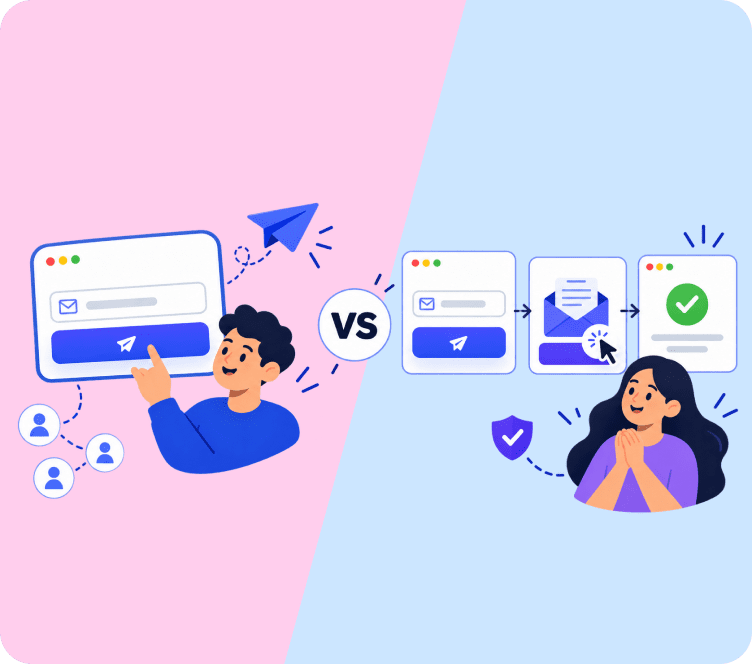
Single Opt-In vs. Double Opt-In Messaging Matrix
Choosing the right opt-in model dictates your success message structure:
| Dimension | Single Opt-In (Instant Access) | Double Opt-In (Verification Required) |
|---|---|---|
| Best For | Mobile apps, eCommerce stores, lead magnets | SaaS platforms, fintech, compliance-heavy B2B |
| Primary Goal | Minimize friction; push immediate browsing/action | Clean list hygiene; prevent fake/bot signups |
| On-Screen Message Focus | “Account ready! [Go to Dashboard]” | “Check your inbox to verify and activate” |
| Drop-Off Risk | Low friction (0% verification drop-off) | 10-25% drop-off if verification is slow |
Testing & Conversion Optimization Checklist
Before shipping your next registration message, audit it against this 6-point checklist:
- Instant Feedback: Does the success message appear within < 200ms of form submission?
- Device Responsiveness: Does the modal/toast scale cleanly without overflowing on mobile screens (375px width)?
- Email Address Echo: Does the message display the user’s submitted email (e.g., “Sent to [email protected]”) so they can catch typos immediately?
- Spam Folder Heads-Up: Does double opt-in copy suggest checking the Promotions or Spam tab?
- Resend Link Present: Can the user click “Resend verification” without navigating away from the screen?
- Analytics Tracking: Is our event trigger (
gtag/plausible) firing on the confirmation render to measure funnel completion?
Final Thoughts & Next Steps
A polished user registration success message transforms a routine administrative step into an immediate conversion catalyst. By combining clear on-screen confirmation with instant next-step guidance, you capture user momentum when intent is highest.
Ready to connect your signup forms to automated onboarding sequences? Explore Adflipr’s marketing automation workflows to trigger personalized welcome emails, track user activations, and build high-converting customer journeys effortlessly.
Frequently Asked Questions (FAQs)
The first sentence must explicitly confirm the successful action (e.g., “Your account has been created” or “Registration successful”). Avoid ambiguous phrases like “Thank you for your submission.”
No. The registration success message is an on-screen UI confirmation displayed immediately after form submission. A welcome email is an automated inbox message sent shortly after to deliver credentials, guides, or onboarding steps.
Keep it between 15 and 35 words (1-2 sentences). Detailed guides, product tutorials, and brand stories belong in follow-up welcome email sequences, not on the confirmation modal.
Yes! In eCommerce, displaying the welcome coupon code directly on the confirmation screen with a 1-click “Copy Code” button lifts immediate checkout conversion rates by up to 18%.
If you auto-redirect users after registration, provide a 3 to 5 second visual countdown timer (e.g., “Redirecting to your dashboard in 3 seconds…”) with a manual “Click here if not redirected” fallback link.