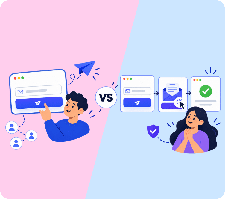

Every email you send creates an immediate psychological impression before the recipient reads a single sentence.
If an email arrives with crowded walls of text, broken mobile formatting, or confusing buttons, the reader immediately closes the tab or hits delete. Conversely, an email with clean typography, clear visual hierarchy, and an obvious call to action inspires trust and drives immediate clicks.
Whether you are writing a formal business inquiry or designing a high-converting promotional campaign, understanding what is email format is the foundation of effective digital communication.
This comprehensive guide breaks down the essential anatomy of email formatting, compares technical formats like HTML versus plain text, provides ready-to-use templates for formal and marketing use cases, and outlines best practices to ensure your messages look flawless across every device.
Quick Answer: Email format refers to the visual structure, layout organization, and technical coding (such as HTML or plain text) of an email message. A proper email format includes six core elements: sender envelope, subject line with preheader, personalized greeting, focused body text, a clear call to action, and a compliant footer.
The 6 Universal Layers of an Email Format
Regardless of whether an email is a simple one-to-one workplace note or a sophisticated marketing campaign, every effective message consists of six structural layers:
| THE 6 STRUCTURAL LAYERS OF AN EMAIL | |
|---|---|
| 1. Sender Envelope | From Name + Sending Email Address + Reply-To Address |
| 2. Subject & Preheader | Engaging Hook (Under 50 Chars) + Preview Text Snippet |
| 3. Salutation | Personalized Greeting (e.g., “Hi Alex,” or “Dear Ms. Davis,”) |
| 4. Message Body | Inverted Pyramid Flow + Short 2-3 Line Paragraphs |
| 5. Call to Action (CTA) | Single Prominent Button or High-Contrast Action Link |
| 6. Footer & Sign-Off | Professional Signature + 1-Click Unsubscribe + Legal Address |
Layer 1: The Sender Envelope
The sender envelope tells the recipient who is contacting them. It includes your display name, sending email address, and reply-to address. Using a recognizable name (such as “Sarah from Adflipr” rather than a generic “noreply@”) establishes immediate trust and improves open rates.
Layer 2: Subject Line and Preheader Hook
Your subject line is the gatekeeper of your message. Keep subject lines between 35 and 50 characters to prevent mobile truncation. Pair your subject line with an intentional 40 to 60 character preview text snippet to extend the context. For tested formulas, explore our curated list of best subject lines for email marketing.
Layer 3: The Salutation (The Greeting)
Set the appropriate tone right away.
- Formal Business: “Dear Mr. Davis,” or “Dear Dr. Miller,”
- Professional Workplace: “Hello Jordan,” or “Hi Alex,”
- eCommerce / Marketing: “Hey Sarah,” or jumping directly into an energetic headline.
Layer 4: The Core Message Body
Structure your body copy using the inverted pyramid model: lead with the most important value proposition, follow with supporting details, and guide the reader toward action. Keep paragraphs under three lines to make scanning effortless on smartphones.
Layer 5: The Call to Action (CTA)
Every email should have one primary objective. Whether you want the recipient to review an attached report, schedule a call, or buy a product, make the next step unmistakable using high-contrast buttons or concise anchor links.
Layer 6: The Footer and Sign-Off
- In Business Emails: Include a professional sign-off (“Best regards,”), your full name, job title, company, phone number, and LinkedIn profile.
- In Marketing Emails: Legal compliance requires an obvious one-click unsubscribe link, your physical business address, and links to your preference center.
The 3 Primary Email Format Archetypes
Different communication goals demand different structural layouts. Here are the three most common email format examples used across modern business:
Archetype 1: The Formal & Professional Business Format
Used for job applications, executive communication, B2B inquiries, and legal correspondence.
Dear Ms. Thompson,
I hope this email finds you well.
I am reaching out after following GreenPack’s recent expansion into biodegradable retail mailers. Our team at EcoLogistics has developed a regional distribution network that currently reduces fulfillment transit times by 35% for sustainable eCommerce brands.
Given your upcoming quarterly expansion, I would welcome the opportunity to discuss how our fulfillment routes can support your supply chain goals.
Would you be open to a brief 10-minute introductory call this Thursday at 2:00 PM EST?
Thank you for your time and consideration.
Best regards,
David Miller
Director of Logistics Partnerships | EcoLogistics
Phone: (555) 019-2834 | LinkedIn: linkedin.com/in/davidmiller-logistics
Archetype 2: The High-Converting Marketing & eCommerce Format
Used for promotional sales, product drops, and automated lifecycle sequences.
You can customize pre-built layouts for this format using Adflipr’s eCommerce email templates and design responsive blocks with our drag and drop email builder.
Archetype 3: The Hybrid Plain-Text Founder Format
Used for customer feedback requests, VIP onboarding, and high-deliverability sales outreach.
Hey Sarah,
I wanted to send a quick personal note to thank you for ordering our Classic Leather Boots last week.
Our workshop crafts every pair by hand, and I want to make sure your boots fit comfortably right out of the box. Have you had a chance to try them on yet?
If you have any questions about leather care or sizing adjustments, simply reply directly to this email. I read every message personally.
Thanks again for supporting our independent brand,
Marcus Vance
Founder, Vance Leatherworks
Technical Comparison: HTML vs Plain Text vs Rich Text Formats
Understanding the technical construction of an html email format versus text formats helps you choose the right format for your audience:
| Format Type | Technical Composition | Best Use Cases | Pros & Cons |
|---|---|---|---|
| HTML Email Format | Coded using HTML & inline CSS | Marketing campaigns, product launches, newsletters | Pros: High visual branding, buttons, live product feeds. Cons: Higher spam filtering risk if poorly coded. |
| Plain Text Format | Raw ASCII/Unicode text only | Personal 1-to-1 notes, sensitive security alerts | Pros: 100% inbox deliverability, fast loading. Cons: Zero visual branding or graphic buttons. |
| Hybrid Rich Text | Basic HTML (bold, italics, links) | B2B sales outreach, executive correspondence | Pros: Natural personal feel, clean link formatting. Cons: Lacks advanced catalog and design blocks. |
For guidance on balancing visual design with live copy, consult our guide on email text vs content ratio.
6 Golden Rules of Mobile-First Email Layouts
More than 65% of all digital messages are opened on mobile devices. If your email format structure is not optimized for smaller screens, your conversion rate plummets.
| MOBILE-FIRST FORMATTING CHECKLIST | |
|---|---|
| 1. Single-Column Layouts | Avoid multi-column desktop breaking |
| 2. Minimum 16px Body Font | Ensures effortless legibility without zooming |
| 3. 44px+ Tap Targets | Thumb-friendly full-width CTA buttons |
| 4. Under 50-Char Subject Lines | Prevents title truncation on smartphone screens |
| 5. Dark Mode Tested Assets | Transparent PNGs with high contrast |
| 6. Fast-Loading Lightweight Assets | Keeps total email size strictly under 100KB |
- Enforce Single-Column Flows: Multi-column grids create horizontal scrolling issues on smartphones. Single-column layouts guide the reader down naturally toward the CTA.
- Set Minimum 16px Font Sizes: Tiny body fonts force users to pinch and zoom. Stick to 16px to 18px body copy with 22px to 28px subheadings.
- Design Large, Thumb-Friendly CTA Buttons: Ensure clickable buttons are at least 44 pixels tall and span the full width on mobile screens.
- Test for Dark Mode Rendering: Use transparent PNGs for brand logos so they do not show awkward white boxes when inboxes switch to dark backgrounds.
- Keep Total File Size Under 102KB: Gmail automatically clips messages larger than 102KB with a “View entire message” prompt, hiding your footer and CTA.
5 Common Email Formatting Mistakes to Avoid
| Formatting Mistake | Why It Harms Performance | The Solution |
|---|---|---|
| The Wall of Text | Giant dense paragraphs cause immediate reader fatigue | Break copy into 2-sentence micro-paragraphs with bullet lists |
| Image-Only Emails | Blocked images leave the recipient with a blank white box | Always balance product imagery with live HTML text and buttons |
| Multiple Competing CTAs | Asking readers to do five things leads to zero action | Focus on one primary goal and one prominent CTA button |
| Missing Alt Text on Images | Screen readers and image-blocked clients show broken icons | Add descriptive alt text describing the image content |
| Illegible Low-Contrast Colors | Light gray text on white backgrounds fails accessibility standards | Maintain high contrast between background and text colors |
For broader operational strategies, explore our comprehensive guide on email marketing best practices.
Build Responsive Email Formats Effortlessly with Adflipr
Designing high-converting email layouts does not require manual coding or hiring specialized developers.
Adflipr gives businesses and store owners all the tools needed to build, automate, and scale professional email campaigns:
- Drag & Drop Visual Designer: Build responsive, mobile-ready emails with our no-code drag and drop email builder.
- Pre-Built Layout Library: Choose from dozens of professionally designed templates in our eCommerce email templates library.
- Automated Lifecycle Sequences: Trigger welcome journeys, abandoned cart recoveries, and win-back flows using our marketing automation platform.
- Smart Audience Segmentation: Target contacts based on purchase history and engagement with our built-in contact management system.
- 1-Click Store Integrations: Deep integrations for Shopify stores and WooCommerce stores synchronize your catalog and order data automatically.
To learn how to structure multi-email automated journeys, explore our guide on what is email automation.
Frequently Asked Questions
Email format refers to the visual layout, structural components, and technical coding (such as HTML or plain text) used to compose and present an email message.
A professional email format includes a clear subject line, preheader text, formal salutation, concise message body, a single call to action, and a professional signature or footer.
HTML emails support rich graphics, custom typography, and clickable buttons, while plain text emails contain only raw unformatted text, offering maximum inbox deliverability.
A business email should ideally stay between 50 and 125 words, allowing the recipient to grasp the core message and required action in under 30 seconds.
A single-column mobile-responsive layout following the inverted pyramid model is the most effective structure, guiding the reader from a bold headline directly to the call to action.
Preview text acts as a secondary subject line, giving recipients valuable context in their inbox view to increase open rates before they even open the email.